- UWP
After many searches on my favorites search engines, I was unable to find a complete tutorial to group items and
customize the headers of a ListView.
So I decided to create this tutorial; at the end of it you can download the full source code and play with it :)
For this post, we will display the members of the French Football Team that just won the World Cup!
Prepare the data
In a PlayerViewModel we have the list of players, and we need to filter it depending on their position on the field, to create a group
of players. To do that we defined an enum class called Position.
private ObservableCollection<GroupInfosList> _players = new ObservableCollection<GroupInfosList>();
public ObservableCollection<GroupInfosList> Players
{
    get => _players;
    set => value = _players;
}

public void GeneratePanierByStatusGroup(List<Player> players)
{
    var query = from item in players
                group item by item.Position into g
                orderby g.Key
                select new { GroupName = g.Key, Items = g };

    foreach (var g in query)
    {
        GroupInfosList info = new GroupInfosList();
        info.Key = g.GroupName + " (" + g.Items.Count() + ")" ;

        foreach (var item in g.Items)
        {
            info.Add(item);
        }

        Players.Add(info);
    }
}
In the code above we use a query to order our players depending on their position on the field. Then we can add all the players groups
in our ObservableCollection with a custom group name defined by info.Key.
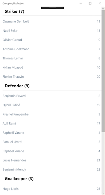
As you can see we display the name of the player position and the number of players in this group.
Manage the View
Display the list of players
Now we can design the list in xaml using the ListView component :
<ListView ItemsSource="{Binding Source={StaticResource PlayerSource}}">
    <ListView.ItemContainerStyle>
        <Style TargetType="ListViewItem" BasedOn="{StaticResource ListViewItemExpanded}">
            <Setter Property="HorizontalAlignment" Value="Stretch"/>
            <Setter Property="HorizontalContentAlignment" Value="Stretch"/>
        </Style>
    </ListView.ItemContainerStyle>
    <ListView.ItemTemplate>
        <DataTemplate x:DataType="models:Player">
            <Grid>
                <Grid.ColumnDefinitions>
                    <ColumnDefinition />
                    <ColumnDefinition Width="50" />
                </Grid.ColumnDefinitions>
                <TextBlock Text="{x:Bind FullName}" Style="{StaticResource TextStyle}" />
                <TextBlock Grid.Column="1" Text="{x:Bind Number}"
                           Style="{StaticResource NumberTextStyle}" />
            </Grid>
        </DataTemplate>
    </ListView.ItemTemplate>
    <ListView.GroupStyle>
        <GroupStyle>
            <GroupStyle.HeaderTemplate>
                <DataTemplate>
                    <TextBlock Text="{Binding Key}" Margin="10,0"
                               Foreground="Black" FontWeight="Bold" />
                </DataTemplate>
            </GroupStyle.HeaderTemplate>
        </GroupStyle>
    </ListView.GroupStyle>
</ListView>
The key point here is the GroupStyle.HeaderTemplate tag: it gives us the ability to display the title of each group that we previously defined in
the info.key variable.
To bind a list of grouped items to our ListView we need to use a CollectionViewSource :
<Page.Resources>
    <CollectionViewSource x:Name="PlayerSource" Source="{Binding Players}" IsSourceGrouped="true" />
</Page.Resources>
The CollectionViewSource is the key thing. It has our players grouped list as a Source and it’s used like a
StaticResource in the ItemsSource property of our ListView.
By doing that, you will get the default design of a ListView grouped items:
Add some design
Customize the group header
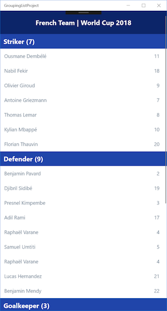
Our list is a bit sad, let’s give it some colors!
To be able to redesign the group headers we need to redefine the GroupStyle.HeaderContainerStyle tag. To do that, I recommend
you to copy & paste the default ListViewHeaderItem template from the generic.xaml class and play with it.
If you don’t know how to get it, just press F12 on your keyboard or right click and choose Go to Definition on an official
ThemeResource, for example the default Background of a new generate page :
Background="{ThemeResource ApplicationPageBackgroundThemeBrush}"
You will be automatically redirect to the generic.xaml file.
In the code below, we define our group Header (Background, Margin…) So we have full control on it.
<GroupStyle.HeaderContainerStyle>
    <Style TargetType="ListViewHeaderItem">
        <Setter Property="FontFamily" Value="{ThemeResource ContentControlThemeFontFamily}" />
        <Setter Property="FontSize" Value="{ThemeResource ListViewHeaderItemThemeFontSize}" />
        <Setter Property="Background" Value="#2045aa" />
        <Setter Property="Margin" Value="0" />
        <Setter Property="Padding" Value="12,8,12,0" />
        <Setter Property="HorizontalContentAlignment" Value="Left" />
        <Setter Property="VerticalContentAlignment" Value="Center" />
        <Setter Property="MinHeight" Value="{ThemeResource ListViewHeaderItemMinHeight}" />
        <Setter Property="UseSystemFocusVisuals" Value="True" />
        <Setter Property="Template">
            <Setter.Value>
                <ControlTemplate TargetType="ListViewHeaderItem">
                    <ContentPresenter x:Name="ContentPresenter"
                                Background="{TemplateBinding Background}"
                                Content="{TemplateBinding Content}"
                                ContentTemplate="{TemplateBinding ContentTemplate}"
                                ContentTransitions="{TemplateBinding ContentTransitions}"
                                HorizontalContentAlignment="{TemplateBinding HorizontalContentAlignment}"
                                VerticalContentAlignment="{TemplateBinding VerticalContentAlignment}" />
                </ControlTemplate>
            </Setter.Value>
        </Setter>
    </Style>
</GroupStyle.HeaderContainerStyle>
Add a header to our list
Finally, let’s add a header on top of our player list. It’s very simple, we just add the content in the ListView.HeaderTemplate tag :
<ListView.HeaderTemplate>
    <DataTemplate>
        <Grid Background="#0c2569" Height="70">
            <TextBlock Text="French Team | World Cup 2018" FontWeight="Bold"
                       HorizontalAlignment="Center" VerticalAlignment="Center"
                       FontSize="20" Foreground="White" />
        </Grid>
    </DataTemplate>
</ListView.HeaderTemplate>
Here is our final result :
You will find full source code in this Github repository.
Happy coding!
You liked this tutorial? Leave a star in the associated Github repository!